PROJECT
Brand & Logo Design
Custom-built brand identity including logo design, color system, and real-world applications.
CLIENT
Monika Tišljar
ROLE
Brand & Logo Designer
STACK
Affinity / Adobe
DURATION
1 month
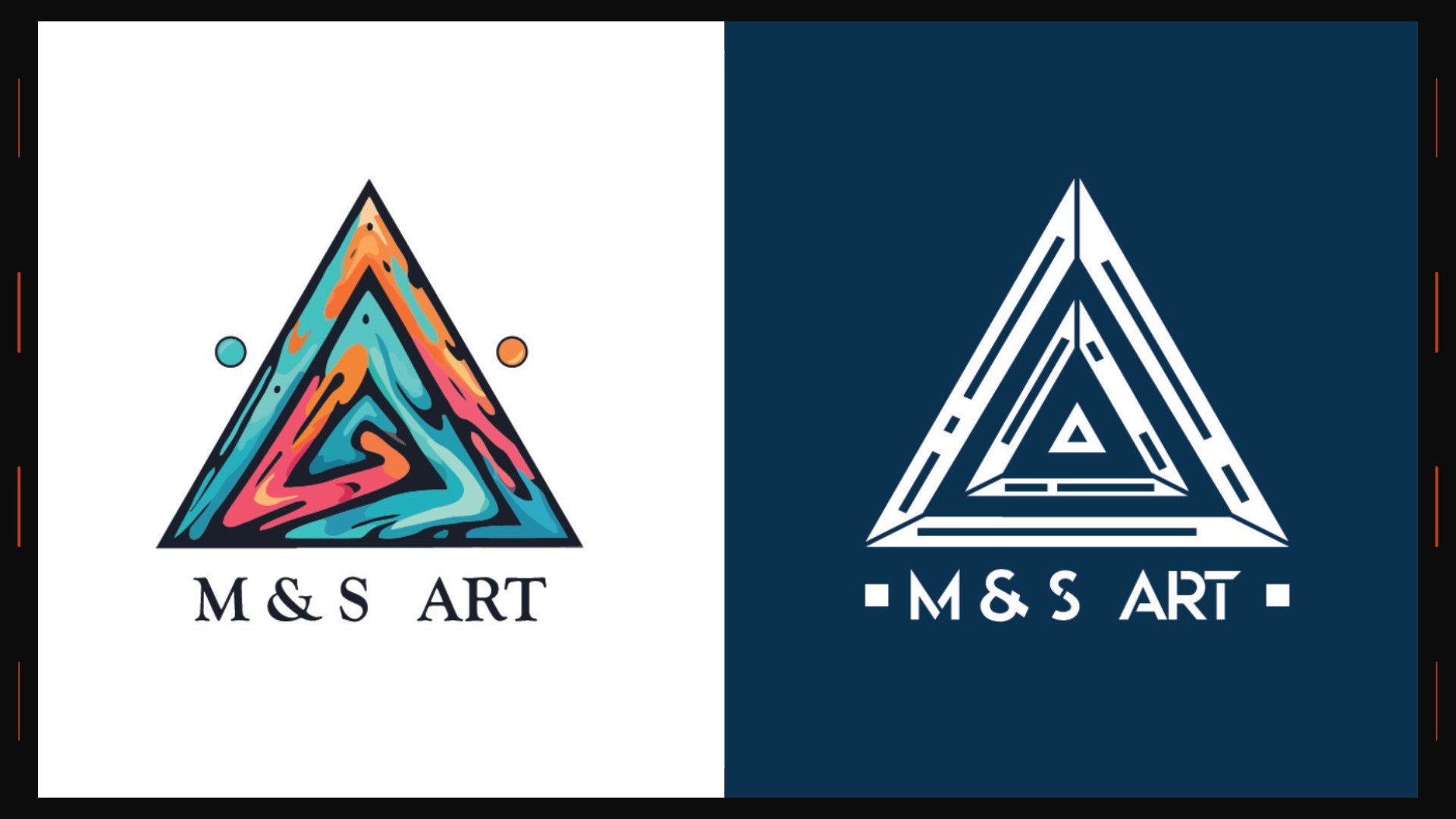
A recognisable mark. A consistent visual language.
M & S Art brings expressive colour and a precise geometric structure into one identity. The triangular symbol carries the personality; the restrained wordmark gives it a clear foundation.
01 / THE IDEA
Build an identity that feels creative without becoming complicated. The logo needs to hold its character on a large presentation and remain readable when reduced to a small signature.
02 / THE VISUAL SYSTEM
The identity pairs a colourful primary mark with a simplified, single-colour version. Deep blue anchors the palette, while the brighter accents add energy. The same proportions and spacing keep both versions recognisable.
03 / DESIGN APPROACH
Start with the silhouette. Refine the internal geometry, balance the wordmark, then check contrast and scale. A good identity should work in colour, in one ink, on a light surface, and on a dark one.
04 / APPLICATIONS
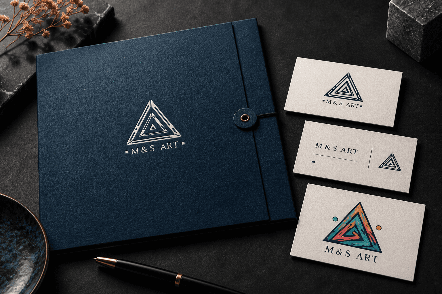
Logo lockups, a focused colour palette, and clear spacing rules form the core system. Presentation mockups explore how that language could extend across printed stationery and digital touchpoints.
THE DETAIL THAT MATTERS
Consistency does the quiet work. When proportion, colour, and spacing agree, the identity feels deliberate wherever it appears.
Presentation note: any newly generated mockups are concept visualisations for this portfolio, rather than photographs of produced materials.