PROJECT
Brand & Logo Design
Custom-built brand identity including logo design, color system, and real-world applications.
CLIENT
Monika Tišljar
ROLE
Brand & Logo Designer
STACK
Affinity / Adobe
DURATION
1 month

M & S Art – Brand Identity
A recognisable mark. A consistent visual language.
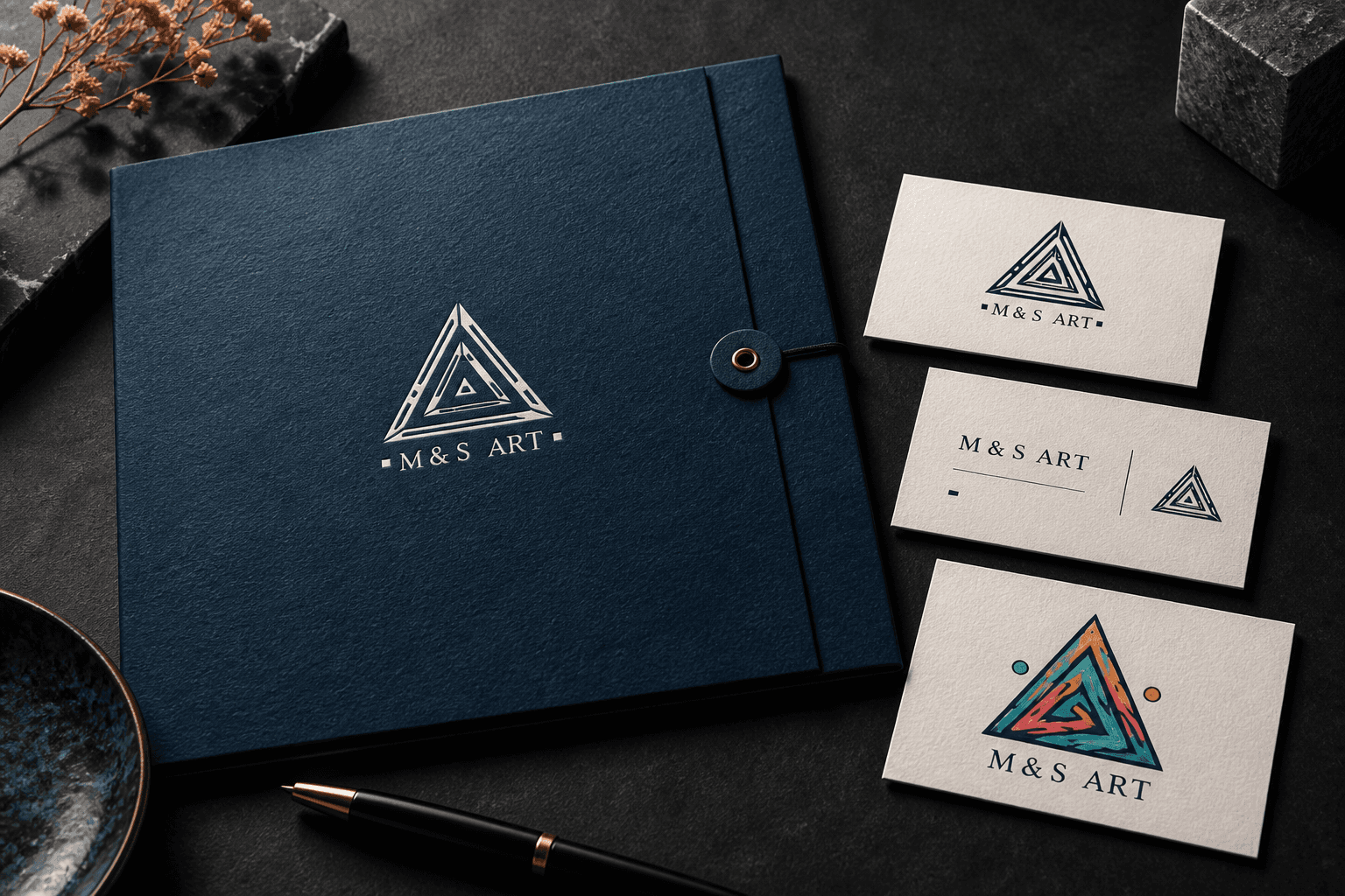
M & S Art brings expressive colour and precise geometric structure together in one cohesive identity. The triangular symbol gives the brand its personality, while the restrained wordmark creates a clean and stable foundation.
01 / The Idea
The goal was to create an identity that feels creative without becoming visually complicated.
The logo needed to retain its character at larger sizes while remaining clear, readable, and recognisable when reduced to a small signature.
The key was finding the right balance between:
creativity
simplicity
recognisability
flexibility across different formats
The result is an identity that feels distinctive without relying on unnecessary complexity.
02 / The Visual System
The identity combines a colourful primary mark with a simplified single-colour version.
Deep blue acts as the visual anchor, while brighter accent colours introduce energy and personality.
Both versions follow the same proportions, spacing, and core geometry, ensuring that the brand remains recognisable across different applications.
Core Elements
primary full-colour logo
simplified monochrome version
defined colour palette
consistent proportions
clear spacing rules
Together, these elements form a system that stays visually connected in every use case.
03 / Design Approach
The process began with the silhouette.
From there, the internal geometry was refined, the relationship between symbol and wordmark was balanced, and the design was tested across different scales and contrast conditions.
A strong identity should work:
in full colour
in a single colour
on light backgrounds
on dark backgrounds
at both large and very small sizes
The goal was not simply to create a visually appealing logo, but to build a system that remains functional in real-world use.
04 / Applications
The core identity is built around the logo, a focused colour palette, and clearly defined spacing.
Presentation mockups explore how the same visual language can extend across:
printed stationery
brand materials
promotional applications
digital touchpoints
everyday communication assets
This allows the identity to function as more than a standalone logo and become a consistent visual system.
The Detail That Matters
Consistency often works quietly in the background.
When proportion, colour, spacing, and scale all work together, the identity feels intentional wherever it appears.
That sense of control is what makes a brand feel complete rather than like a collection of separate design elements.